Apple Email Redesign
Used Tools
Figma | Illustrator | Aftereffects
Duration
June 2021 | 3 weeks
Apple Email is an email app designed by Apple that is already pre-installed on the iPhone. Due to easy access and ease of use, such as great integration with other Apple apps, many users are familiar with using the app. However, as one of the users of this app, there are possible features that could be improved for better usability.

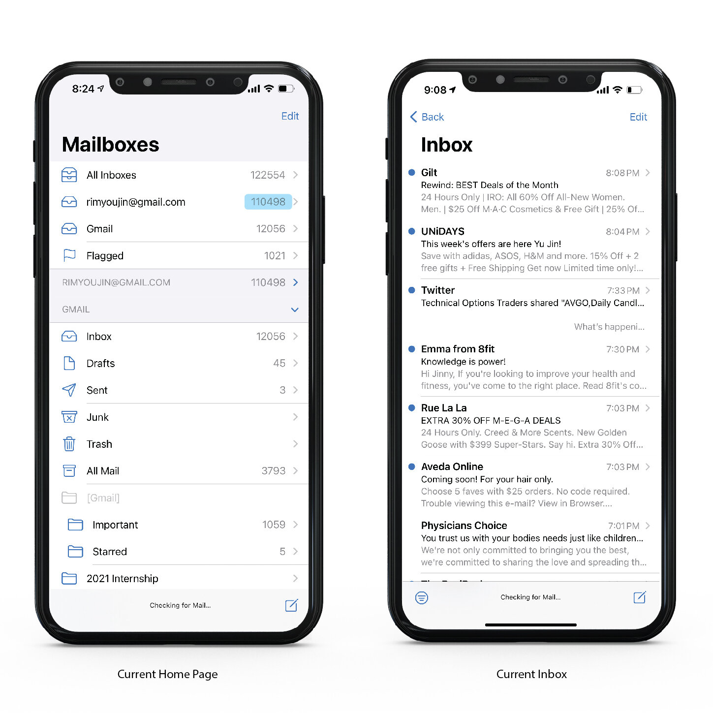
Actual iPhone Mail app
Problem
As one of the iPhone users, it is often difficult to avoid using the app. I am also one of the active user of this app—I check daily and almost hourly. And somehow, I still have about 110498 emails in one inbox. (Probably more now). This inbox will probably lead to full inbox where I can’t even receive any more emails.
During my usage, there are three major problems that I faced while using the app.
Too minimal information hierarchy
Overall, Apple's Mail app is cluttered with information. Even on the main home page, all text except the main title is created with the same size while there are limited whitespace,
Hard to find Emails
People usually receive three types of emails: personal, social media platform notification, and finally promotions that they usually subscribe to in the beginning for a discount. However, since there is no differentiation between these emails, it is hard to tell which is more important and which can be ignored.
Limited Customization
Finally, there is limited customization for the users to create a mail homepage based on their needs. Depending on their priority, users should be able to organize and create folders that are important on the front page.
Personas

Nathan
Age: 35
Job: Freelancer
Nathan mostly uses email apps for work-related purposes. He has multiple clients who work with him simultaneously, therefore he has many starred items or emails that are saved accordingly to the clients.

Mary
Age: 48
Job: Housewife
Mary is not a very technical person, but she does have an email account where she gets her personal emails. She often signs up for newsletters to receive any discounts.

Jonathan
Age: 19
Job: College Student
Jonathan recently joined college. He just received his new school email, but he is more comfortable using his personal account. He communicates with his school colleagues with his school account, but he keeps his important information with his personal email account.
Design Solutions
Based on user research, here are the possible opportunities that could be accomplished for the listed personas.
More customization settings for different types of users
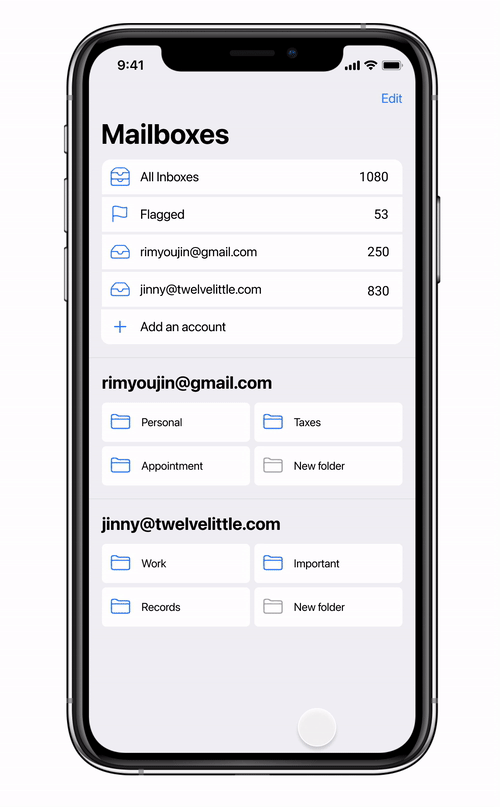
Main Page
Instead of having all the drop-down of the mailboxes visible on the front page, users are able to customize the main page based on their needs.
Users are also able to easily add their new email account in the Mail app.
Emails
Differentiate email types will allow users to find personal emails quickly.
Machine learning of subscription emails, which is used to prevent any overcrowding of unread emails.
Design
Adding more white space between different mailboxes will remove any clustered information.
Design
Additional Type Hierarchy
There was minimal type differentiation between the folder’s name and the account name. Adding a bigger and bolder font will give more legibility for users to distinguish the folders and the accounts.
Flexible 1 & 2 Column Design
The original mail folders were organized in one single column. This created a narrow height of division boxes that feel clustered. Creating 2 column folders list design gives more separation between the account list and folder list while effectively using spaces.
Action Color
Apple often uses blue as the main color for many of their app. In order to keep it consistent, blue is used as an action color to indicate it is a clickable button.


Newly designed home page & adding an account
Main Home Page
Add an Account Feature
Users are able to directly add an account through the app, instead of going into the iPhone setting.
Removal of All Email Folders
There are too many folders of the inboxes on the front main page. This makes it users difficult to find the custom folders that they have created. So the individual folders of the inboxes are moved inside the individual inbox folder.
Custom Saved Folders
Custom folders that were created within the mailbox will appear on the front home page for easy access for the users. They can also add new folders and save received emails into the new folders.
Mailbox
Light blue in the app is already a secondary color in the app. To add more diverse action indications and contrast with other elements, the blue will be used more to characterize users’ movements.
Footer to Header
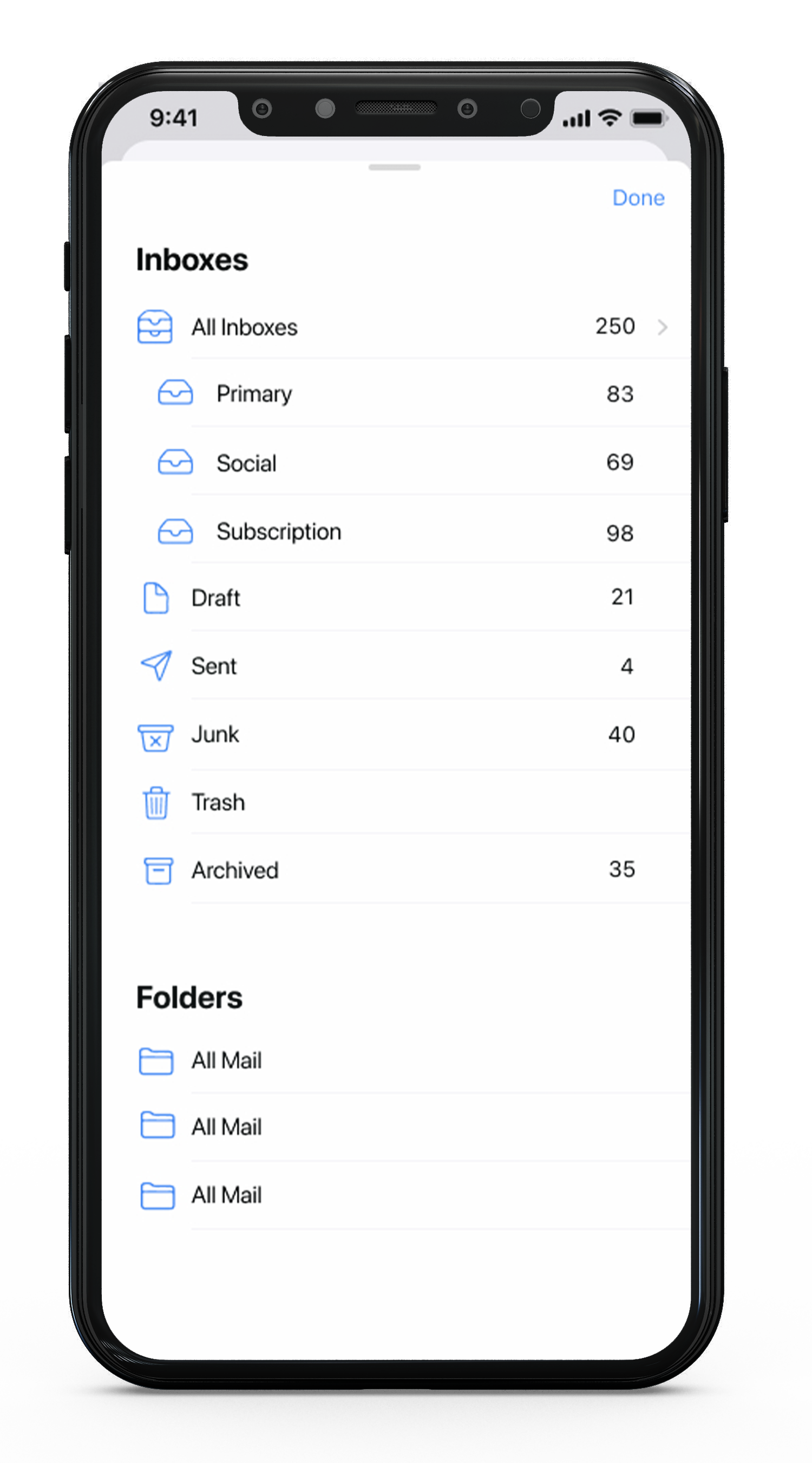
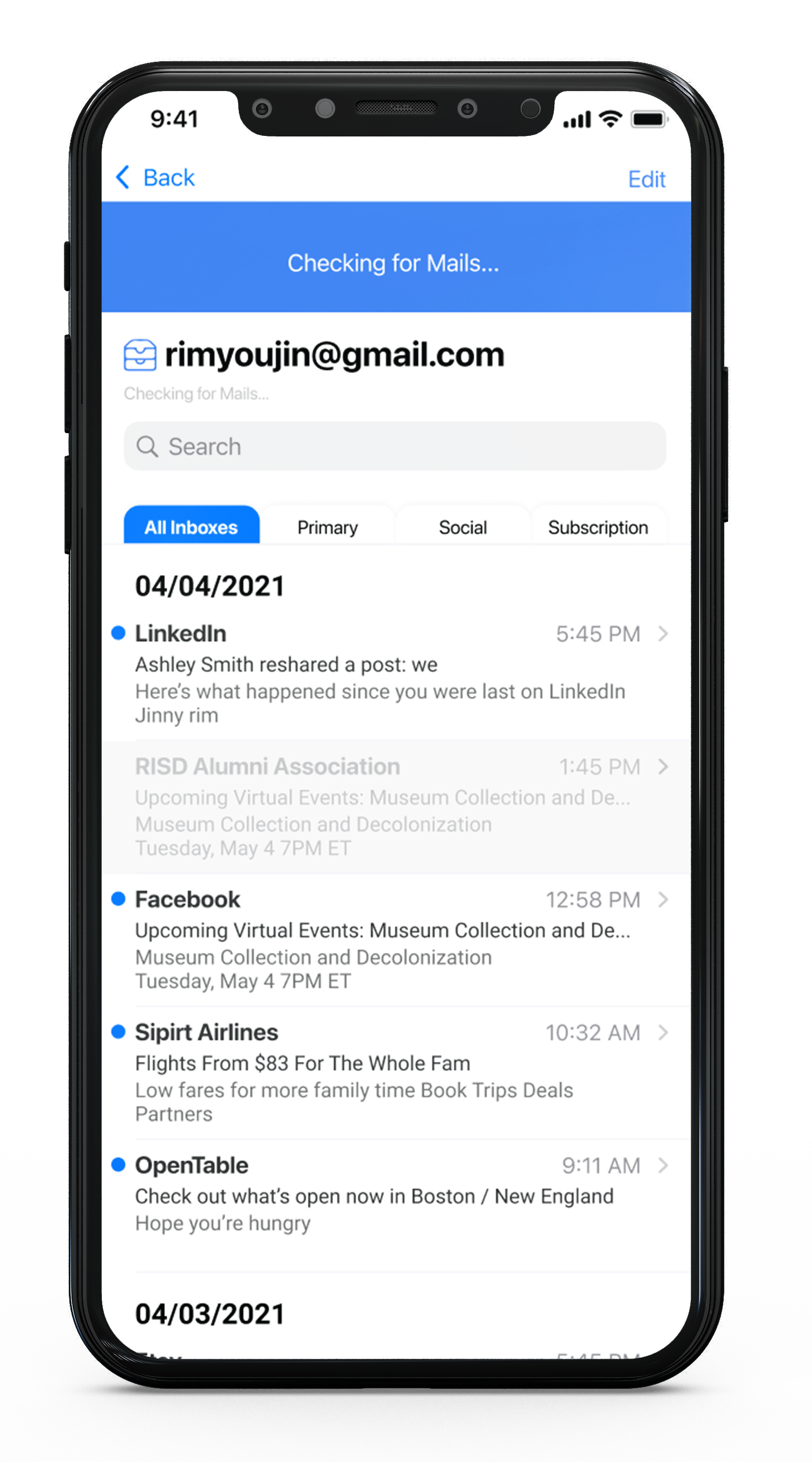
The original footer in the app where users know when the screen is updated is now placed at the top of the screen. Also, an invisible search is placed under the Inbox name.
Types of mails
Depending on the purpose of the e-mails, each will be categorized accordingly. There are 3 types of categories: Primary, Social, and Subscriptions.
Labels
Instead of “Inbox” on the top, the email address will be shown. This will create less confusion for users who have multiple accounts within the app
Dates are added to the mail list, this will be especially useful in the saved folders when users want to quickly know when the emails were received or sent.
Mailbox folder
The all the folders from the home page are now placed within the individual inboxes. The screen will be visible when the user clicks the blue box next to the Inbox Address.

Draft Mail from Folder
Saved Folder
The saved folder consists of emails that were moved from the inbox. It also auto list contacts from the emails, which allows users to quickly and easily send emails to the following receiver.
Draft Button
Since the bottom footer is removed, the new draft button has been placed out on top of the mail list, giving a longer scroll view.
Saved Contact
Inside a created folder, users will have automatically generated contacts that will appear under Saved Contacts. This will allow users quick emails sent to the following receiver. Additional contact can be added by pressing the “Add Contact” button on the corner.
Attachment
Users drag the screen to refresh the page. Instead of small text on the bottom showing the page is loading, the blue screen appears that the page has been loaded.
Subscription Analysis
To prevent Mailboxes from overflowing with promotion emails, this technology could be useful for users to keep their mailbox capacity more efficient. Companies that
There could be analytics that could be added into the program to recommend users to unsubscribe to the following newsletter.

If a user has not opened the newsletter for 90days.

The recommended newsletter will be listed under the search menu. If users think they will not open the email anymore, they can click the “x” button and the old emails that weren’t read will be also deleted or moved to the trash can.
This will prevent overflow of the mailbox and also decrease phone storage.

Screen Designs
Here are some additional screens of the app.


Possible Ideas
It all begins with an idea. Maybe you want to launch a business. Maybe you want to turn a hobby into something more. Or maybe you have a creative project to share with the world. Whatever it is, the way you tell your story online can make all the difference.
Thank you for scrolling